Paint it red and black: the man behind the Rolling Stones’ iconic lips logo
As The Rolling Stones release 'Hackney Diamonds', meet the man who brought their iconic lips logo to life.
By Dom Walbanke
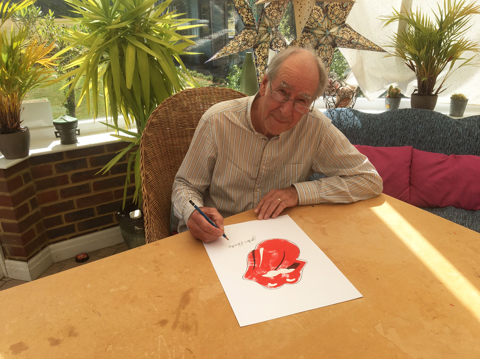
With a final stroke of the pencil, hunched over the conservatory table of his suburban Surrey home, John Pasche signs off another print of the Rolling Stones tongue and lips logo.
“I’ve been producing these for the last few years and it’s really my main source of income,” says the 78-year-old, who sells the prints for about £2,500 via his website.
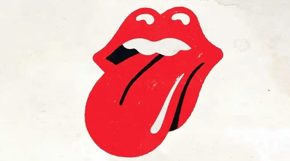
Pasche is the designer behind arguably the most famous logo in world music – certainly in rock – although it’s almost 40 years since he sold its copyright to the Rolling Stones for £26,000 on advice from his lawyer. The band granted him permission to make the prints a few years ago and some featured in their RS No. 9 shop in Carnaby Street – a three-year-old store where the logo features as an acrylic sculpture, neon sign and on everything from hoodies, wash bags and insulated water bottles.
But Pasche is not rock and roll, and, despite the logo commonly and mistakenly being attributed to Andy Warhol, has no pop art influences in his home. “All the stuff I’ve got is pretty neutral, quite classical,” he says.
54-years ago, the Royal College of Art recommended Pasche, then just 25, to Mick Jagger after the singer approached the College – the only post-graduate design college at the time – to create a poster for the Rolling Stones’ upcoming 1970 European Tour.
“I was broke at the time,” Pasche says. “If you imagine I was a student for nine years and I needed money… but during that time, I was doing bits of artwork for album sleeves and doing those at weekends.”
His poster – a throwback to 1920s and 30s travel posters – impressed the band enough for him to be contacted later that year and asked if he could meet with Jagger, himself only two years older than Pasche, to talk about the creation of a logo for the band.
“We had a meeting and Jagger wanted something that would stand alone as an image, not using any images of the band at all,” he explains. “Mick quoted the example of the symbol for Shell… that was a strong part of the brief.
“Then he showed me a picture of Kali, the Hindu goddess which he had torn out from a magazine page from the corner shop and said, ‘I really like this’. I think that was the trigger for the concept because she had a little pointed tongue. I’m not sure whether he meant it was the whole Indian theme that he liked – that was quite popular at the time – but for me I just saw the mouth and the tongue and thought immediately of the way he would stick his tongue out at people, its sexual [connotations], and had that at the back of my mind when I left the meeting.
“I said I would go and draw something up and then I spent about a week or two drawing up these designs… I drew about three different versions of it from different angles.
“I then had a second meeting with him and he said ‘Oh yeah, I really like that’ – which was the one I favoured. It was all very simple, really.”
Pasche was paid £50 for the initial artwork, “although to be fair to them a year or two later when it started to be used more, they did pay me an extra £250 just to say, ‘we should have paid you a bit more, really,’” he laughs. They also offered a percentage of their sales.
“Initially the logo was not a huge deal – it was going to be for their letterheads, new label which they were just starting and small uses, really,” he says. “It grew to be a lot bigger than that.”
Pasche is speaking shortly before the release of ‘Hackney Diamonds’, the Stones’ first album of original material in 18 years. On the promotional material for that record is a modern update of the lips that Pasche first designed all those years ago.
The logo Pasche designed is also not the exact version you see on t-shirts, the wash bags in No 9 Carnaby St or will feature later this month on the shirts of Barcelona’s soccer players in their El Clasico tie against Real Madrid to promote the album as part of their sponsorship with Spotify.
“The record company wanted to release stuff as quick as they could,” he explains. “The original artwork which I did was faxed to the States… so it had to be re-drawn and it wasn’t redrawn exactly in the way I had produced the artwork.”
The “more aggressive” changes made by designer Craig Braun include the extra highlight on the tongue and a harder black outline.
“Unfortunately, that’s the predominant design,” he says. “People might look at it and not be able to tell the difference; it meant quite a lot to me but that’s all water under the bridge, really. Unfortunate things happen, it’s just a shame there wasn’t another way of getting the artwork to them immediately.”
Nevertheless, Pasche retained ownership of the logo and a percentage of sales, until it came to a point in 1984 when the Stones wanted to buy the copyright.
“It was a difficult situation really because in those days there was a weird thing called usage rights, where if a company had used a logo or symbol for a period of time, they had a claim to it,” he says. “I had a very good lawyer at the time and he said it’s a bit of a grey area and that I could lose out on this one going against the Stones. I suppose I was a bit intimidated by the situation.”
Pasche accepted a payment of £26,000 for the logo – around £80,000 in today’s money.
“At the time it I was quite happy with it – it was enough to buy my initial small flat in Muswell Hill which kicked me off on the property ladder,” he explains. “Obviously, I kind of regret it but there was good reason why [I did it]. That was the situation at the time. When they actually got the copyright of it and took me out of the picture, they really went to town on the merchandise. It’s obviously brought in millions for them over the years.
“But I was satisfied with the situation and I’m not really one to look back and get worked up about it really.”
Undoubtedly, Pasche’s iconic design for the Stones solidified his reputation as a talented young designer. A reputation which attracted commissions from bands such as The Stranglers and opened doors in future design work – including a creative director’s position at record label Chrysalis Records and the opportunity to set up his own design agency.
The original artwork was later auctioned in 2008 and bought for just over £50,000 by the V&A museum.
The last post before his retirement was as a creative director at the Southbank Centre, “mainly doing stuff for classical music and ballet,” he says. “It was a refreshing change. I was still doing sleeves and so on but for a completely different subject matter, so I enjoyed it.”