The artists behind some of Britain’s most iconic album covers
Rolling Stone UK meets three homegrown masters of record sleeve design: Peter Saville CBE, Keith Breeden and Malcolm Garrett MBE
By Lee Campbell
‘You wouldn’t in your wildest dreams have expected to be a singular success at anything; just to hopefully get by. This has been a wonder to us for 40 years,” says Peter Saville as he reflects on what he and fellow record sleeve designers Keith Breeden and Malcolm Garrett have achieved in the British music industry. They are a trio I like to call the ‘Holy Trinity’ of artwork and graphic design in the music world.
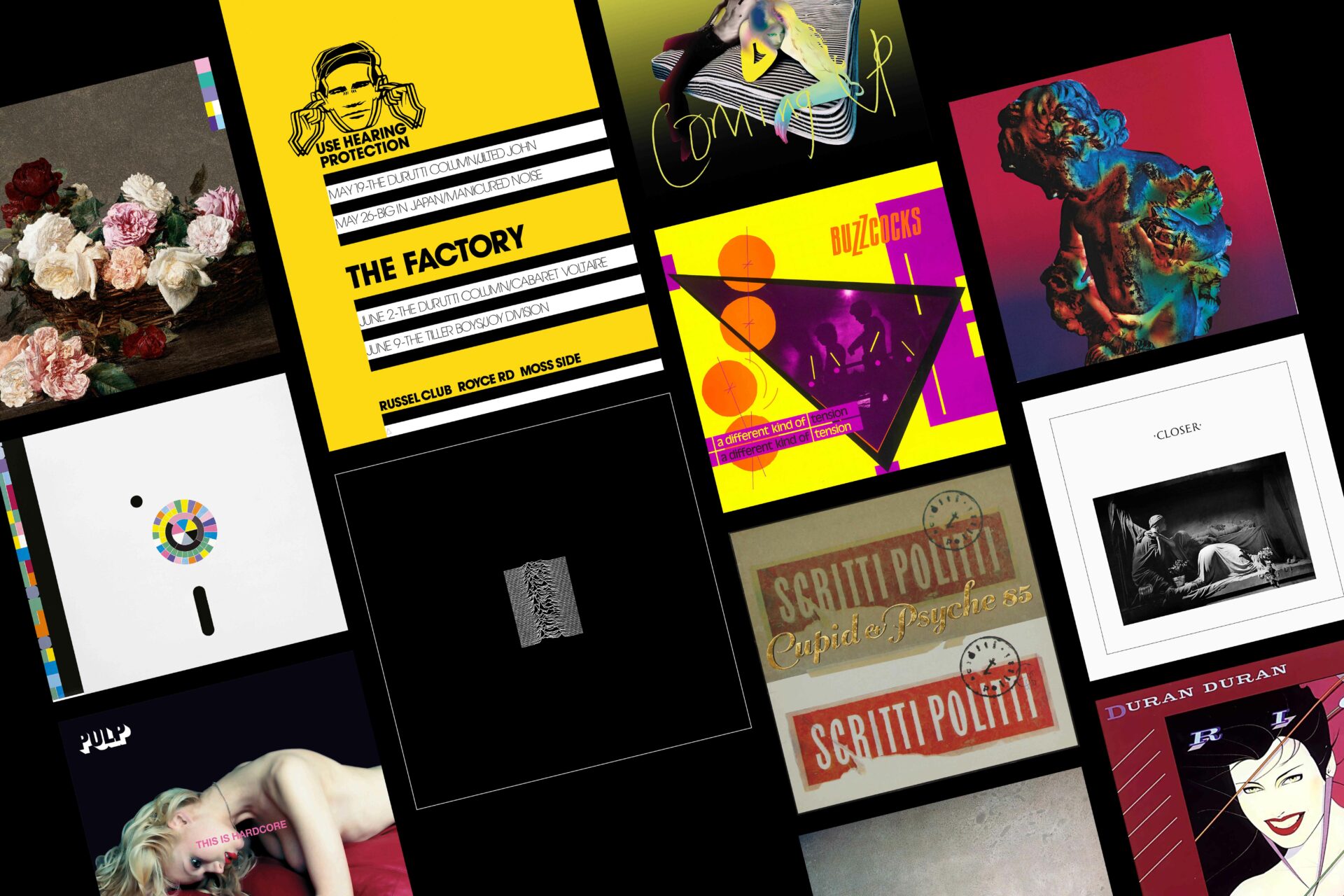
From the rise of punk until the mid-80s and 90s, individually these three men masterminded the record sleeve artwork and band merchandise for around 100 artists. From Duran Duran’s Rio to New Order’s Power, Corruption & Lies, some of the most memorable album and single covers resulted from their creative vision.
What is almost as extraordinary as their legacy is that they all studied A-level art together at St Ambrose College in Altrincham, south-west of Manchester, from 1973-1974.
Today’s video interview is the first time they have spoken together since the mid-80s. Garrett is sharing Saville’s video link from the former’s home/office in Clerkenwell, London. Breeden, meanwhile, is calling in from the wilds of Llanfihangel in central, rural Wales. He is softly spoken and measured in his delivery, while Saville is expressive and flamboyant. Garrett is somewhere in the middle.
At school, an unassuming mentor had the most profound effect on these three young lads from the north-west of England. “If it wasn’t for a man called Peter David Hancock, this would not have happened,” says Saville. “We were all under his tutelage since we were 13 or 14 years old. He was a hip, young art teacher and he was very open-minded to the kinds of work that we could do. All sorts of experimental things. He recognised our passion and vocation for visual art and said, ‘Have you boys considered graphic design?’”
“The album sleeve that you carried into school said so much about you without you having to say a word”
— Malcolm Garrett MBE
“It was a term we had never heard of,” adds Garrett.
“We didn’t imagine that it would necessarily work out or we would amount to much,” says Saville.
Garrett remarks that they “struck lucky” by starting their careers at the right time: punk was a catalyst and a game-changer.
Saville elaborates, “There was a ‘coup d’état’ in pop culture that was punk and for around 18 months, the back door of entertainment was open to anyone that wanted to contribute.”
Breeden agrees: “In those days, a lot of the bands, they couldn’t play, they couldn’t write, they couldn’t sing. Do you remember The Desperate Bicycles? They were useless, but that was the way it was.”

The boys gathered influences from a range of sources, including themselves. Garrett underlines this: “I was always drawing inspiration from Keith. He was the star and had an amazing imagination. For my part, I liked letters and words.” He declares, laughing, that he wasn’t particularly skilled at drawing. “To be honest, I was always trying to be as good as Keith,” he confides.
“We were always in record shops looking at sleeves,” recalls Breeden. He remembers being drawn to them as a child. “It’s like a lot of things in life, it’s about accessibility and expectations. As a kid, I never had access to art. It wasn’t on my radar. Our access to art was perhaps only through record sleeves.”
For him, they possessed aura and mystique. “They build a corporate image for the band. I remember the Pink Floyd album [Ummagumma] when I was a youngster, where they laid out all the musical equipment on a runway. I remember looking at it, saying, ‘This must mean something.’ I thought that Pink Floyd had the keys to some knowledge that I didn’t have.”
Garrett has similar memories of record covers that made a lasting impression on him. “I was particularly into German electronic music. I distinctly remember the Faust album. It was clear vinyl, in a clear sleeve with red screen-printing. I was always interested in things that had a physicality, a hard-edged graphic flavour, and obviously, the Warhol banana on the Velvet Underground album [The Velvet Underground & Nico].”
“We related to record covers as a study in their own right, independent of the music that was in them,” adds Saville, who at just 23 became co-founder and art director of the now legendary Factory Records, working with Rob Gretton, Martin Hannett, Alan Erasmus and the enigmatic Tony Wilson. “Part of our fixation was the visual work. We saw the record cover as our form or medium of pop art.”
Creating a record sleeve was the epitome of rebellion against the disciplines of visual communication, a sentiment that appealed to all three. “None of the criteria of communications design is applicable to record cover design,” says Saville, “so by doing record sleeves, all of us were granted an extension of our adolescence.”
The glamour was also a draw. “We wanted to be hip. Doing a record sleeve is almost like being in a band,” says Saville.
It wasn’t a lucrative occupation, however. “Sleeves are incredibly expensive but you don’t get paid much for doing them,” adds Saville. “That is an indicator of their real value. It was during our working period that the music video became predominant and album sleeve budgets just disappeared.”

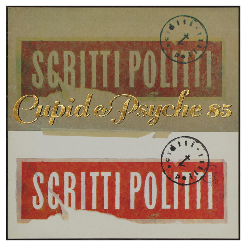
When asked to reveal a significant album cover that they masterminded, Breeden dives in first. “I did a record sleeve for [an album by] Scritti Politti called Cupid & Psyche in ’85. I had a couple of years that were a bit of a watershed for work. I did ABC’s [How to Be a] Zillionaire! at that time also.”
Returning to his work on Cupid & Psyche, he says: “We were going to do something totally different and it didn’t work out. I was left with about three or four days to spare and there were all these bits kicking round the studio. The head of marketing at Virgin had a firm that did this [embossed] block foil finish. He was keen to use it, so I thought it would be a great opportunity.
“Scritti Politti was really the creative vehicle of one person: lead singer Green Gartside. He was, like me, a perfectionist, and very visually aware. He had a very clear idea about what he wanted. If you listened to his music, it’s very literary, very thoughtful. The sleeve conveys the feeling of the music as best as anything I think that I did without words. With Scritti, there was a richness of texture to the sound and the lyrics. The music in its layering was almost visceral. All of the Scritti stuff was about touch and feel. It was like chocolate; the sensory nature of things. The contrast between the masking tape and the signature stuff, the block foil, encapsulated everything.”
Garrett offers a completely different genre. “For me, it’s A Different Kind of Tension by the Buzzcocks [in 1979]. The first two albums were compromised in different ways. I was trying to please the band, so for the third album I thought, ‘Fuck the band! I’ll please myself and come up with something that I think represents the band.’
“We saw the record cover as our form of pop art”
— Peter Saville CBE
“The title was the only thing I knew about the album at the time,” he continues. “I went to see Pete Shelley, who was the one person in the band that I really connected with, aside from Richard Boon, the manager. I showed Pete the visual for this sleeve which was a bit excessive. Pete loved it.
“I discovered when I listened to the album that my favourite track was ‘I Believe’. Today it remains my favourite. Pete Shelley at that time was going through a bit of a breakdown, taking too many psychedelic drugs, he was unhappy — the usual rock’n’roll pressures. It was the last album before he would go and make a solo album. This was the third album. The first had a square picture, the second had a circular picture, so the third for me had to have a triangular.”
Garrett continues, “There’s one line in ‘I Believe,’ which to this day I’m not sure if it was already written or whether he wrote it after seeing my visual: ‘Triangular cover concealing another aspect from view.’ When I heard that I thought, ‘Wow! Either I’ve had a premonition or Pete has seen the sleeve rough and written that line.’ I was very interested in continuity. It was the angularity and the depth or layers of the Buzzcocks’ songs that appealed to me. I captured that.”
Another contender could have been Garrett’s cover for Duran Duran’s Rio, which is generally acknowledged as one of the best album covers of all time.
“For the Rio sleeve, I didn’t do or choose the [Patrick Nagel] illustration,” he reveals. “That was given to me, and I took it and put it into my visual world. I refused to just take an image and put it on the sleeve. For me, you had to have a longevity with all the singles and all the promotional material. It was part of an entire visual language. So, I took it and put it into a graphic framework.”
He reflects on Rio’s cultural impact. “Young people say to me, ‘That sleeve made me want to become a graphic designer.’ I feel good that I was able to deliver something that had a real effect on a significant number of people all over the world. It is truly a global record.”
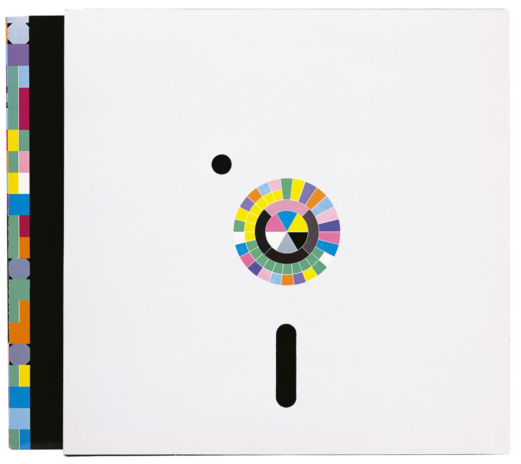
It is no surprise that Saville chooses an album cover from the Factory Records stable: New Order’s Power, Corruption & Lies.
“It’s truly biographic and I didn’t realise it was when I was doing it,” he says. “It’s kind of partnered with ‘Blue Monday’. They are one and the same. It has been quite influential in what some people refer to now as ‘The Big Flat Now’ — the convergence between the disciplines.”

Odd though it may seem, the sleeve concept would be created without its designer having listened to the music. Saville reveals: “Usually, you don’t get to hear these records before you design the cover. The sequencing of the tracks is really important to the listening experience. The deadline for the record cover is the same day as what’s called ‘the cut’. The artwork deadline can never be before the cut, due to track listing, timing, but as soon as it’s cut, some fucker will say, ‘Where’s the sleeve?’
“Only once have I heard the record before I’ve done the sleeve, even with Factory Records. For Power, Corruption & Lies, I did what I wanted to do, but when I listened to it, there is a synergy between the conflation of romanticism and tech — that is front and back of the sleeve, mirrored in the opening track, ‘Age of Consent’, where there are beats and strings, sequencers and synthesisers in juxtaposition. Keith’s description of the Scritti cover being evocative of chocolate or sensation, sensuousness — that felt right. There’s a kind of empathy which happens serendipitously.”
Saville could just as easily have chosen another of his designs: Unknown Pleasures by Joy Division is arguably one of the most iconic album sleeves.
He explains its origins: “Their manager Rob Gretton gave me a folder with some track titles, samples, a photocopy from a newspaper and the diagram from The Cambridge Encyclopedia of Astronomy. He said that the band would like it white on the outside and black on the inside.
“I went into the studio in Manchester that I had access to at the time — early ’79. That was my first album cover and I used the photo mechanical transfer (PMT) camera to try and figure out what I was doing. There was a wonderful new innovation in the camera room at that time which was called reversal paper. Instead of giving you a positive bromide copy, it would give you a reversal. So of course, I did a reversal of the pulsar data and it was exotic and exciting, mysterious and very ‘twilight zone’ when it was white out of black.
“Whenever I attempted to put the album title or the name of the group on the front it looked like a record sleeve. I didn’t want it to look like a record sleeve. There was no obligation for it to look like a record sleeve. There was no record company, and what you could call a company, I was a partner in. I made the sleeve that I would like to have at home.”
It was the “11th hour” before the artwork had to be submitted — and Saville rushed the sleeve to the band. “It’s good to be the 11th or 12th hour because no one has time to talk about it. I took it round to Rob’s house the next day.”
Saville then adds an intriguing vignette: “He had received a test pressing of the album the day before, and he asked me if I would like to listen. I didn’t really want to because what I knew of Joy Division was intense. But I couldn’t really decline the offer having just done the sleeve, so I tentatively sat down on the sofa of Rob’s living room and he put on the test pressing of Unknown Pleasures.”
Despite the glamour of working with major artists, it could be difficult.
While Garrett was running design group Assorted iMaGes, he delivered the sleeve design for the first four Duran Duran albums, with Breeden often assisting him in the detailed illustration work.
Garrett remembers working with the band at the height of their fame in 1983-84: “The band were in Australia at the time, and we were struggling to try and get some ideas together. At one point, I said, ‘Look, the problem is, [with their management], there’s seven of you, there’s one of me.’ We needed to chat the thing through to get past this impasse on this particular record, Seven and the Ragged Tiger. So, within five days I had a visa and business-class plane ticket to Sydney. I then came back with an idea of the visual landscape, and only Keith could create that landscape.”
Garrett looks back at his relationship with the band: “I had a clash with them through the entire period. They were forever wanting to work with the people they admired. They would want to work with their heroes, whether that was a photographer, illustrator or producer. The fans just want to believe that the band do it [the design], that everything came from Nick Rhodes’ head and his pen.”
Garrett also recalls an awkward moment on Led Zeppelin’s album cover for Coda. “I flew to Queen’s Litho in Indianapolis, the biggest sleeve-printing factory on the planet. I made the mistake of ‘improving’ (in my eyes) the photograph on the back of this sleeve, which was a black and white photograph that I felt was a little bit muddy on the proof. I adjusted it to give it more contrast. By the time I got back to England, Jimmy Page was absolutely fucking furious and trashed the entire weekend’s printing.”
“Young people say to me, ‘That sleeve made me want to become a graphic designer’”
— Malcolm Garrett MBE
Breeden adds an anecdote from his time working with Pink Floyd’s design agency Hipgnosis. “I didn’t work with Pink Floyd [directly]; I worked with Storm Thorgerson, who was one part of Hipgnosis. We did a lot of work together and we clashed all the time. I love him dearly, but he was bloody hard work. He pushed me harder than probably anyone in my life. He was never satisfied. He just wasn’t a designer, really, so he couldn’t tell a good design from a bad design. It was all about ideas for him, which was counterproductive.
“One particular example was for a Pink Floyd boxset. I had this image in my head of a crucifixion of a naked man raised above the water. It would have been hugely powerful. What actually transpired was a bunch of people, men and women, turned backwards. Mine was full frontal. The final image was completely compromised and watered down.”
On other occasions, negative vibes meant that the prospect of working with a particular artist became nothing more than that. “Malcolm and I always harboured a desire to do something for Kraftwerk,” remembers Saville. “I met Ralf Hütter at a dinner one night and realised that working with him would be no walk in the park.”

He observes: “You don’t take well to the generation who usurp you. I had a clash of egos with everyone, one way or another, but good relationships as well. The one person where the antagonism took off before we got anywhere was Bob Geldof. Bob and I did not get past one meeting!”
They all chuckle at this before he continues, “You are generally working for that individual who is the decision-maker, except for me with Factory and Joy Division or New Order. Ian [Curtis] died before any sort of hierarchy crystallised within Joy Division. They were still four people doing what they did. Ian was not the leader of the group. So, when they continued as New Order, Bernard, Stephen and Hooky were an absolute democracy. Not one of them took the presumption at all to be more important than the others.
“It was not until they reformed in the early 00s that they became Bernard’s band, but from 1980 to 1993 they were a democracy and a democracy of disagreements [the trio laugh]. They would disagree in principle about absolutely everything. Therefore, whenever I sought their consensus on anything, it was futile.”
Saville recalls working on a logo for their publishing company, Be Music. “I asked them, ‘What colour would you like it to be?’ Bernard said blue, Hooky said red and Stephen said green, so I turned to Gillian [Gilbert] and she said yellow. I then turned to Rob to settle it, and he said that it looked good in black. That was the end of the meeting. As they trooped out, I looked at Rob, he said, ‘Just fucking do it.’”
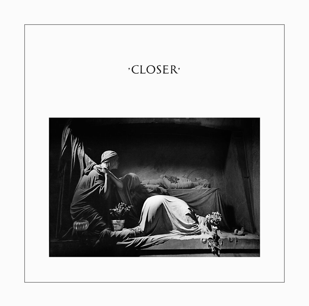
In contrast, choosing the sleeve for Joy Division’s second and final album, Closer, years before, had been harmonious — although the image became especially poignant when lead singer Ian Curtis committed suicide shortly before its release.
Saville tells the story: “I would try to engage them, and they did collectively choose the picture for Closer. Obviously, none of us knew what was in Ian’s mind at that time. So that was very uncanny and unsettling, that he was part of a decision to choose a funeral image. They didn’t really know what Ian was writing and singing as he was doing his vocals at night. Only Annik [Honoré] knew what Ian’s state of mind was. She called Tony to express her concern. Tony replied, ‘Don’t worry, darling, it’s just his art.’”
Saville goes on to open up about his final memories of Curtis. “They played University of London [in February 1980]. They debuted a song that was surprisingly catchy, and Ian put on a white Vox guitar for this particular song. Everybody in the room was thinking, ‘Fucking hell, that’s a song.’ That was ‘Love Will Tear Us Apart.’ Then we went collectively together to eat nearby. He and Annik sat together at a separate table because I think there was a parting of ways at this time. Every time I glanced over at Ian and Annik, there was that ‘tears in their eyes’ look. I thought, ‘That’s a bit intense and sorrowful.’”
After the Closer sleeve went to print, Wilson phoned Saville to say that Curtis had died. “That caused a summit discussion because I had to point out that we had a tomb on the cover and that this could come across badly and appear to be exploitative. So, there was a crisis meeting in Manchester and the group and Rob decided that Ian had been part of the decision and so we would stick with the cover.”
The part they played in popular culture is not lost on Saville, Breeden and Garrett.
The trio are united in their belief that the art of record sleeve design belongs in youthful hands.
“Young people are ‘of their times’, states Saville, with “a synergy of empathy”. “We knew what would feel right,” he continues. “At the time, the direction that the progressive groups were going had a sort of parallel as to where we were going.”
He points out, “This was our culture and as such it was a shared culture. It is what Tony Wilson would have referred to as — it used to upset me when he used this term, but these days I appreciate the enormity of it — ‘the art of the playground’. There was music. There were pop visuals. There was fashion. There were haircuts. There were movies. It is an absolutely common experience across a generation. The UK is a crucible of pop culture.”
It was a time when people were becoming more visually aware, a trend Saville puts down to David Bowie. “Young people in the 70s were starting to see that the way they looked was increasingly becoming a thing,” he says. “Bowie cannot be underestimated as an influence to us as young people in the increasing sophistication of visual literacy.”
Of course, Saville, Garrett and Breeden played their part in this, too.
“By the mid-80s, I was banned by most of the record companies in London”
— Peter Saville CBE
“We were young practitioners of the readers of visual codes,” states Saville. “I know that all of our work has introduced younger people to ideas and imagery that their own life, schools and family had not introduced them to. They were learning through that liberty we had with record sleeves. We were all aware of a bigger world that we wanted to be a part of.”
Garrett expands on this: “There’s a period in people’s lives when music and the identity of the music that you like becomes a visual shorthand for expressing things about yourself and your own identity that you are not yet equipped to express for yourself. The album sleeve that you carried into school said so much about you without you having to say a word. The one thing I knew about myself is that I wanted to be rebellious. I wanted to be different. But I also wanted to be respected for wanting to be and look different. It’s a weird balance.”
Yet, as Saville, Garrett and Breeden grew older, they found they were no longer in tune with youth culture and decided to diversify.
For Breeden, by the late 80s, the magic of the music industry had begun to fade. “I had a couple of years where I was producing the best work I did, around ’85. I remember being in the basement of my studio, thinking, ‘I am packaging music for a band’ and I didn’t particularly like what they were doing. I didn’t rate it. ‘Why am I doing this? I want to be an artist.’ At the time of the stock market crash in the late 80s, the music industry suddenly became very cost-conscious, and I was quite expensive in terms of what I did — quite elaborate and labour-intensive.
“I was then pushing 40 and felt increasingly divorced from London, the music business and from youth — all the things you need to be involved with if you are going to be doing record sleeves.”
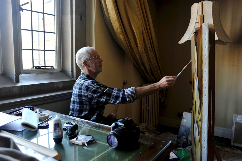
This revelation led Breeden to relocate to rural Wales, where he now works as a portrait painter.
Saville was also branching out. “By the mid-80s, I was banned by most of the record companies in London,” he says. “I was wilful, entirely intent on doing the work I wanted to do and not the work anyone else wanted, or it would be very expensive, and it would be late, and it would be the band who would be calling the shots, and not the record company. I was too troublesome. I have always been too subjective about what is an objective medium. The same applies to all of us: we are all personal about the work,” he says. “By ’85, I was making my steps away from music into culture and museums and then into fashion. By the mid-90s, I had retired from doing record covers.”
That didn’t stop Saville from being asked, though. In 1995, when Suede’s Brett Anderson approached him to do the cover for his new album Coming Up, Saville said he “couldn’t possibly” do it. “He said ‘Why?’, and I said, ‘Because I’m 40, and you are… 26!’ I wrote a list of people he ought to go and see that were more his generation. It’s entirely inappropriate for 40-year-old blokes to be doing record covers for 20-year-olds. In the end, Brett went to see other people but still came back to me.” Saville relented, but, rather than design it himself, agreed to find the right people for the project.
“There was a similar situation with Jarvis [Cocker from Pulp], with This is Hardcore,” Saville continues. “I’ll bring into play the people that are needed to get what they want. In both cases, Jarvis and Brett were executive art director; I was a facilitator. They both turned out to be great sleeves, but I wouldn’t have done them off my own volition. Since then, I have tried to avoid it. People still ask me, but I’m 66! Who the fuck wants a 66-year-old doing their record sleeve?”
The answer is: plenty of people. Saville is still inundated with requests. “I think the last album cover I was involved in was the [2015] New Order album, Music Complete. I oversaw it, assigning one of my associates to its design and layout. But even that one was carried out with some irony. From my personal point of view, it’s not a New Order cover in the sense of my New Order covers. It’s a cover for Bernard [Sumner]. Bernard didn’t want the cover that I wanted to do, but I agreed to help get to a cover that he liked.”
Saville now uses his expertise elsewhere, including the high-profile re-brand of Calvin Klein in 2017 and Burberry in 2018.

He remains in touch with his northern roots. As consultant creative director for Manchester City Council, he played a strategic role in the city’s economic and cultural regeneration, and is also an artistic advisor for Manchester International Festival (MIF).
Although Cheshire-born Garrett is creative director of London design consultancy Images&Co, he is also a big player on Manchester’s cultural scene. He co-founded Design Manchester in 2013, and was also involved with a major audio-visual project at the city’s revitalised Band on the Wall venue, which reopened in March. He is also an Ambassador for Manchester School of Art.
All three have no regrets about leaving their former vocation — although not music — behind. Saville says, “The only artist that I have been listening to, almost exclusively for some time now is not going to ask me to do a sleeve, because she is 700 years old — Hildegard von Bingen. Sacred choral music, preferably with a female voice, is my ambient soundtrack these days.”
As a Billie Eilish fan, Garrett’s tastes are more current. “The most interesting song that I’ve heard recently that appeals to my sense of nostalgia from the 60s is her theme tune from No Time to Die. She has managed to write a Bond song that is in the right spirit of the classics from the 60s yet is nothing like them. It doesn’t have any of those Bond theme clichés, but it is as powerful as ‘Thunderball’.”
Would he design for Eilish if she asked? Garrett is unwavering. “I would say what Peter said, ‘I am the wrong person.’”
And yet the trio’s pop legacy endures. “Like weird, uncanny boomerangs, things you did 30-35 years ago can come back round into your daily working routine with these 30- and 40-year anniversaries,” says Saville. “It’s a very weird feeling. In fact, last Friday, I was looking at a new set of proofs for New Order’s ‘The Perfect Kiss’, and I had a distinct feeling of deja-vu.”
Taken from the June/July 2022 of Rolling Stone UK. Buy it here.